In a fast-paced environment where pixel-perfect design and quick turnarounds are essential, creating an efficient and scalable design system became a top priority for our team. With a sprint-based work structure, the need for a system that enhances precision, collaboration, and adaptability became evident. The challenge was to develop a design system that not only supports rapid iteration but also fosters a seamless relationship between design and development.
This case study explores how we built a robust, flexible design system that meets the demands of both design creativity and development practicality. By focusing on a strong foundational rule set, adaptable components, and responsive layouts, we were able to streamline our workflow and enhance both the quality and efficiency of our design process. Through close collaboration with our development team and leveraging tools like Figma, we have crafted a system that scales with our product’s growth while ensuring consistency across platforms and devices.
Here, we delve into the core elements of our design system—the foundation, components, and layouts—explaining how each piece plays a crucial role in delivering high-quality, user-centric designs, even in the face of tight deadlines.
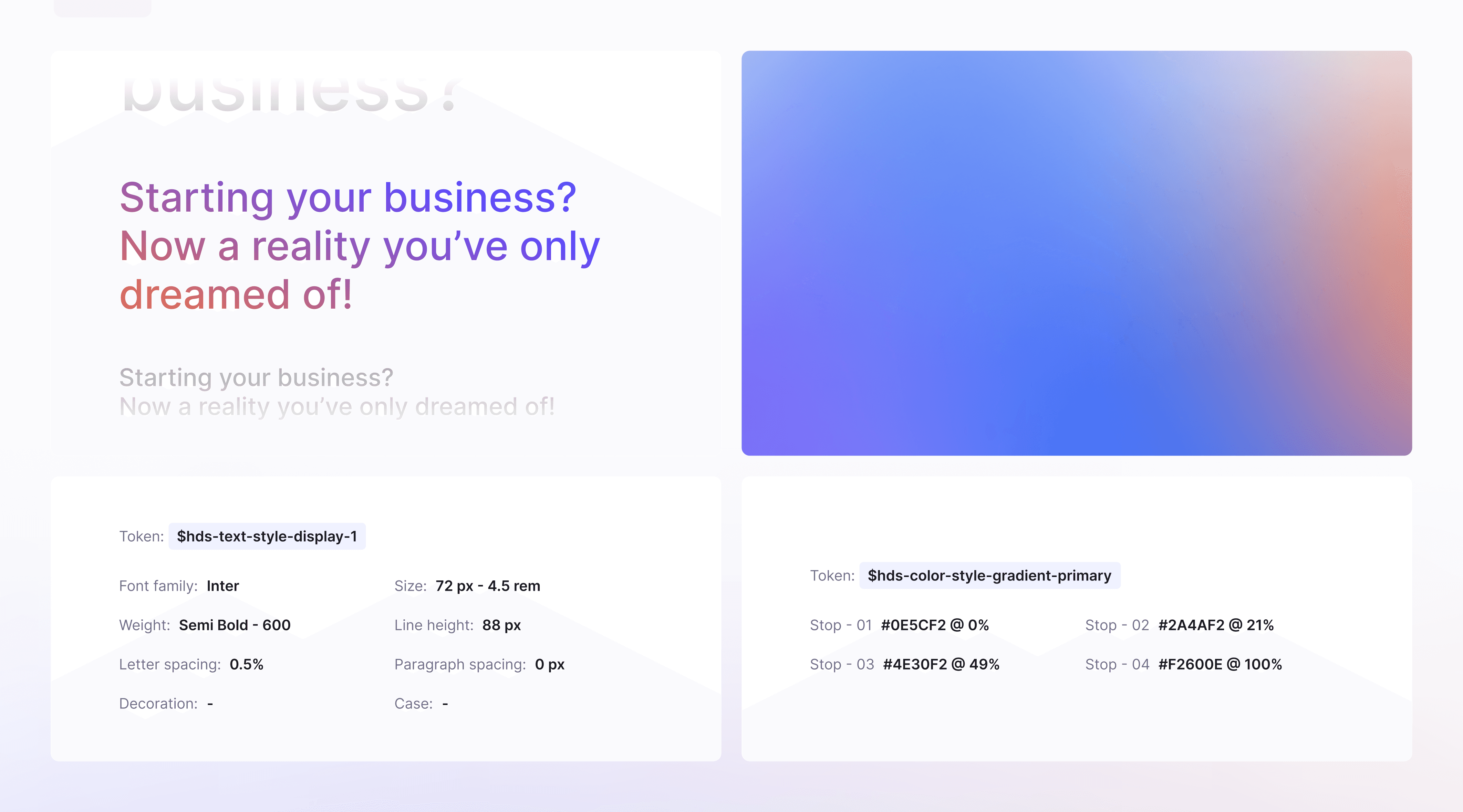
The foundation of the design system serves a pivotal role, acting as the system's backbone. At this level, we formulate the fundamental rules that govern the design system, setting the standards and conventions that we adhere to.
The challenge here was to strike a balance: on one hand, we needed a rigorous rule set that would help uphold the integrity of the design principles and ensure coherence across various design elements. Having well-defined rules is crucial, as it sets the tone for the entire design system and ensures uniformity and consistency.
On the other hand, we also wanted to leave room for creative freedom, allowing us to create stunning and visually appealing user interfaces. We understood that while rules and guidelines are essential, creativity can't be entirely bound by them. We aimed to create a system that could serve as a solid foundation, yet flexible enough to accommodate innovation and originality.
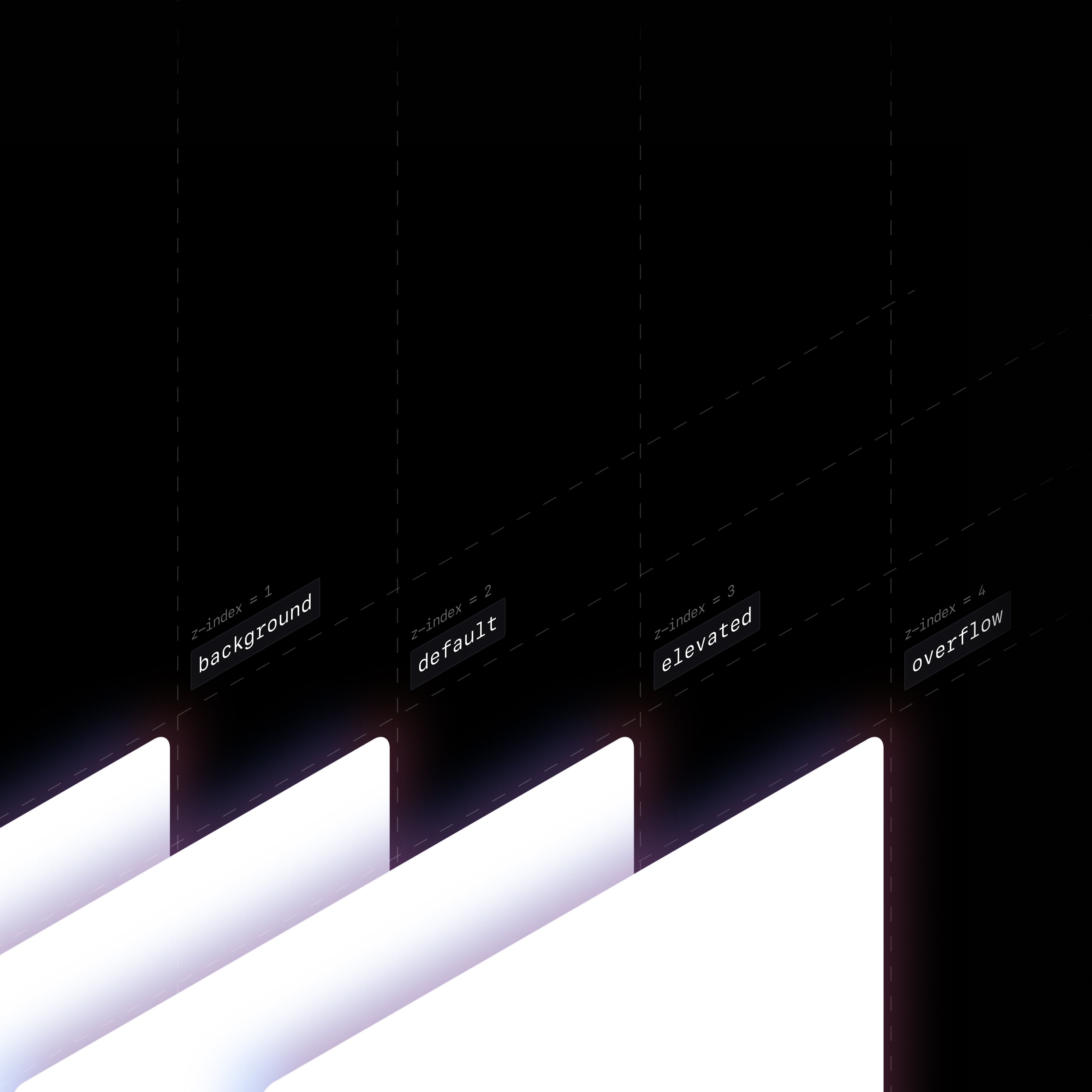
This system is heavily based on a well-defined set of rules, which establish the standard hierarchy among these various levels. The purpose of these rules is not only to bring order to these surfaces but to ensure a clear, visually distinguishable hierarchy. This systematic approach is fundamental in maintaining a consistent visual hierarchy, which is crucial for user navigation and experience. By implementing this, we have succeeded in ensuring coherence and visual harmony across all screens, irrespective of their individual content or functionality.
Case Study Credits
Note
This is a prerelease version of the case study and is subject to updates in both visuals and content. The final version will be published on cometstudio.io.
Collaborators
Art direction, Motion Design
Visual Design


